


Data Visualization
Data visualization is the graphical representation of data to understand patterns, trends, and relationships.
Primary Types of Data Visualization in Data Science
1. Bar Chart

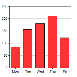
Use Case:
- Compare values across categories
- Show differences between groups
Example:
- Comparing sales of different products
- Number of students in different courses
Example:
If a company wants to compare sales of Product A, B, and C, a bar chart clearly shows which product performs best.
2. Line Chart

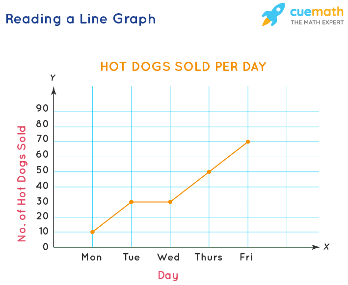
Use Case:
- Show trends over time
- Analyze continuous data
Example:
- Stock market price changes
- Monthly revenue growth
- Temperature changes over days
Example:
Tracking monthly revenue growth of a company over one year.
2. Pie Chart

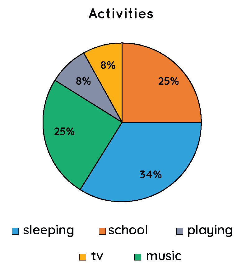
Use Case:
- Show percentage distribution
- Represent parts of a whole
Example:
- Market share of companies
- Budget allocation
Example:
Showing how 100% budget is divided among marketing, production, and research.
3. Histogram

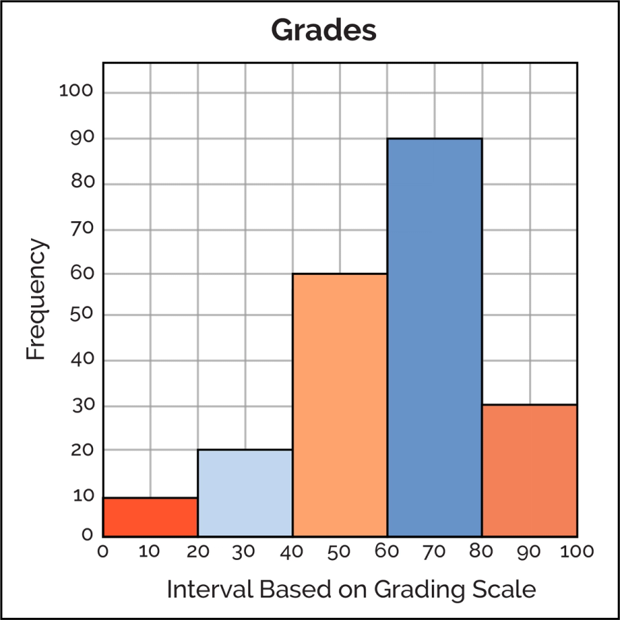
Use Case:
- Show frequency distribution
- Understand data spread and skewness
Example:
- Distribution of exam scores
- Age distribution of customers
Example:
Analyzing how many students scored between 60–70, 70–80, etc.
5. Scatter Plot

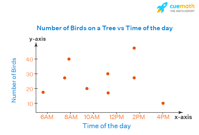
Use Case:
- Show relationship between two variables
- Identify correlation or outliers
Example:
- Height vs Weight
- Advertising cost vs Sales
Example:
If advertising increases and sales also increase, scatter plot shows positive correlation.